Goodbye, sliders
Better controls for furniture dimensions
Nick Stanchenko · June 2026
This whole project started out as a slider.
I needed to choose how many sticks to use for my first stick chair, so I made an interactive visualization.
Fast forward two years, and there are over 130 sliders in the app. They control everything from dovetail angles to shelf spacing to table width.
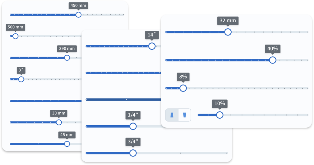
And now they are all gone… Let me explain.
Why slide?
When designing furniture, you want to play with different proportions and see what looks best. For example, how thick should dining table legs be?
Sliders are great for this: you can quickly go back and forth between options, and sometimes you even discover designs you haven’t considered. Certainly beats typing and re-typing numbers into input boxes. (We’ll come back to those later.)
There is just one little problem: a slider only has a fixed amount of travel. Make it span too many values, and they get about as easy to pick as plush toys in a claw machine.
Great
Still usable
WTF?
But not to worry, we can just come up with sensible ranges and increments for each slider. For example, who would ever need a chair wider than 700 mm or 28″? Right?
Reality check
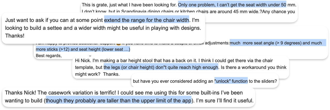
OK, you win.
Apparently, settles (and settees) are a thing.
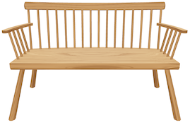
And giant rooms need giant furniture while small children need small furniture.
...And some stools are for bars while others are for your feet. Got it.

All these extreme values, however, would ruin the existing sliders, leaving less than half the space for “normal” values. Not to mention I also got feedback asking for finer increments!
All the bandaids
It wasn’t just about caving in. To be honest, even with normal ranges, some sliders were getting difficult to use. So over time, I came up with a few workarounds.
First, a non-linear slider with bigger steps towards the end.
Second, a coarse slider with fine adjustment.
These worked OK but always felt like a crutch and did not look consistent with the rest.
More recently, I tried to prototype “sliders on steroids” with multiple “zones”, but that seemed overly complicated to use. The zones would have to be arbitrary too.
Then I had a different idea.
Reinventing the wheel
More specifically, a thumbwheel. Look at this thing:
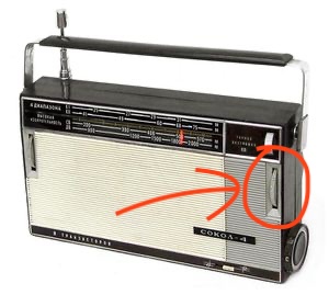
I remember using one on my grandfather’s radio: quick, precise, with a slightly rubbery resistance. You could spin the wheel over and over, covering a long range in small increments.
The same concept is a staple in modern cameras. Except it’s shrunken, clicky and not just for your thumbs anymore.
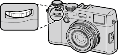
In the digital realm, we are free to pretend that an arbitrarily LARGE wheel is poking through the screen, with a conveniently engraved scale. The interaction is the same: you flick it left or right until you are happy with it.
But wait a second, this already exists. I use it on my phone all the time! 🤦♂️
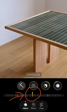
This control, variously known as a wheel picker, dial picker or ruler, has a few benefits. It can be infinitely long, has the same precision all the way, and you can grab it anywhere, not just in a tiny little spot.
It’s also safe to make narrower than a slider, leaving space for a direct number input.
Yes, typing is not fun. But sometimes you already know your board thickness. There is no point in flicking to it. Direct inputs also take care of fine adjustment: just type any value down to 1 mm, 1˚, 1% or 1/16 inch.
The aesthetics
Accepting that I was not going to invent anything, I turned my attention to visual design.
Several physical objects inspired the colors, graphical elements and the overall vibe, even if very subtly (with red swapped for blue).
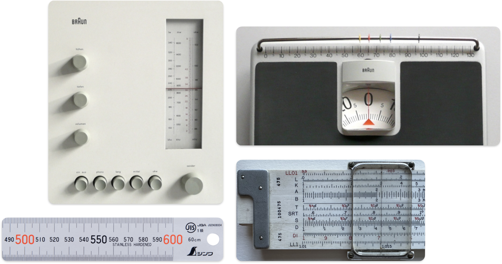
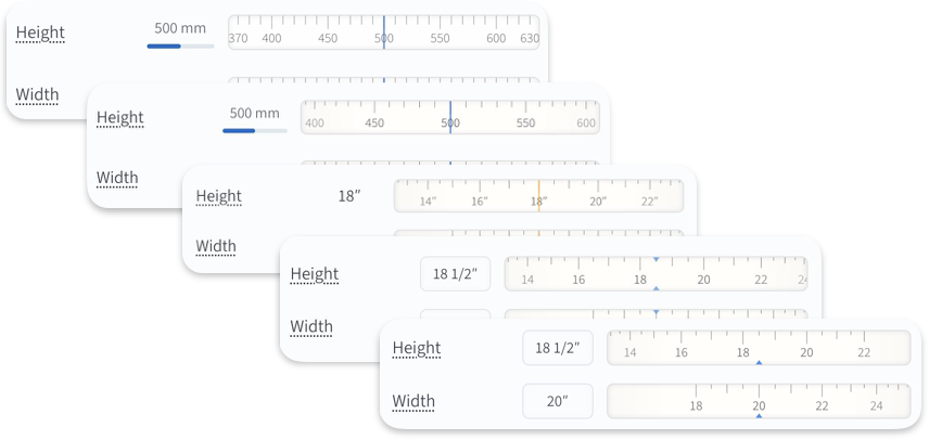
I went through a few iterations, trying to make the controls unobtrusive yet clear to read and obvious to interact with. This included designing coarse, medium and fine versions for all units used in the app (mm, inches, degrees, and percentages).
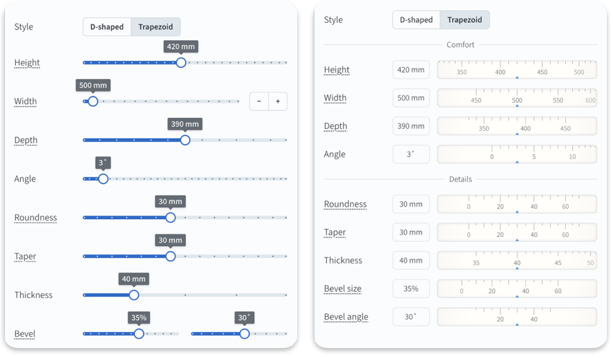
The interface was starting to look uniform and organized. Oh, and more compact too. To polish it off, I used the extra space for a bit more grouping.
Epilogue
In two years, I’ve made several big changes to the app, but most of them have happened behind the scenes or added new functionality, rather than touching existing features.
More than anything else, this change is front and center. And yet I hope it blends in rather than sticks out, and makes using the app more natural. Perhaps — despite all the audio equipment references — it even feels more like woodworking.
Want to give it a spin? Go design a piece of furniture 🙂