
With the grain
On realism in 3D furniture models
Nick Stanchenko · July 2026
Are color and texture important when prototyping a piece of furniture?
At first glance, the answer is “no”. Even with a basic outline, you can (I hope) see which of these two sideboards is more harmonious.
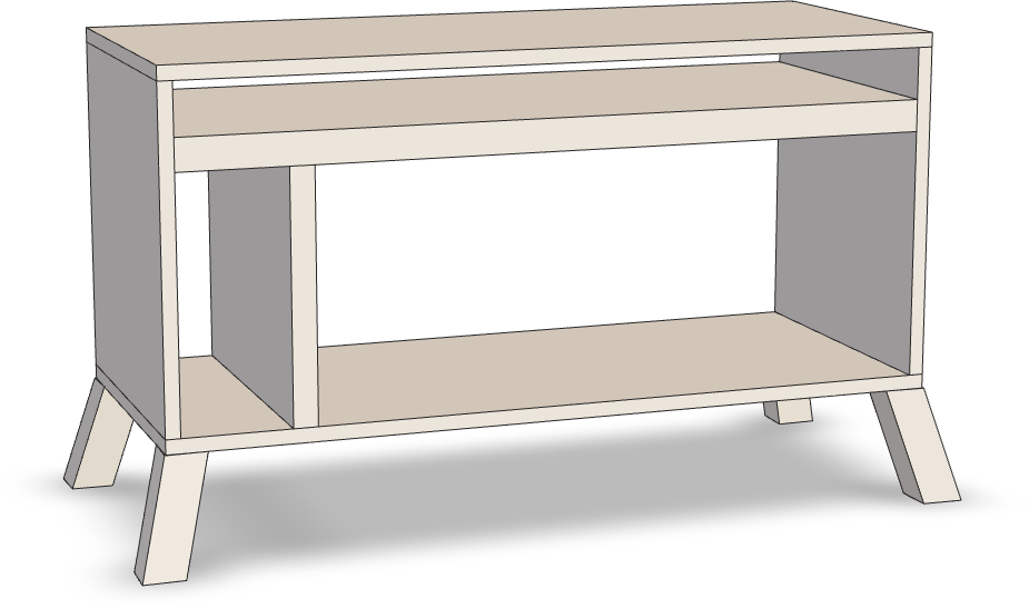
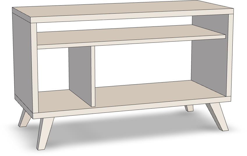
A more realistic rendering might even distract you. After all, can anything look bad in richly colored walnut?
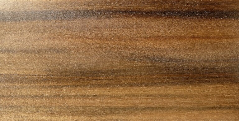
Here’s another argument. For ages, people have successfully designed with pen and paper, and many use apps like SketchUp without ever deviating from the bare look.
So case closed? Not so fast.
Color me interested
Woodworkers are surrounded by wood. It takes us little imagination to envision the mockup in maple, beech, or mahogany. We know what stock we have on hand, and we can see it with our eyes closed.
But non-woodworkers can’t.
So color and texture are helpful when you show your design to customers or family.

Even woodworkers, however, can appreciate a bit of grain. It just feels nicer: more like woodworking and less like software. Virtual grain also hints at how you should orient your boards to avoid issues with seasonal wood expansion and contraction.
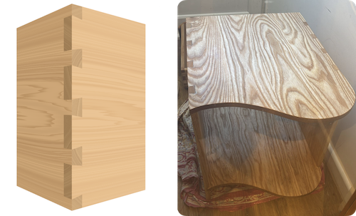
Alas, given my total lack of 3D design experience, the models in the first versions of Layout Computer looked atrocious. After a few false starts, I finally added something resembling wood grain in December 2025.
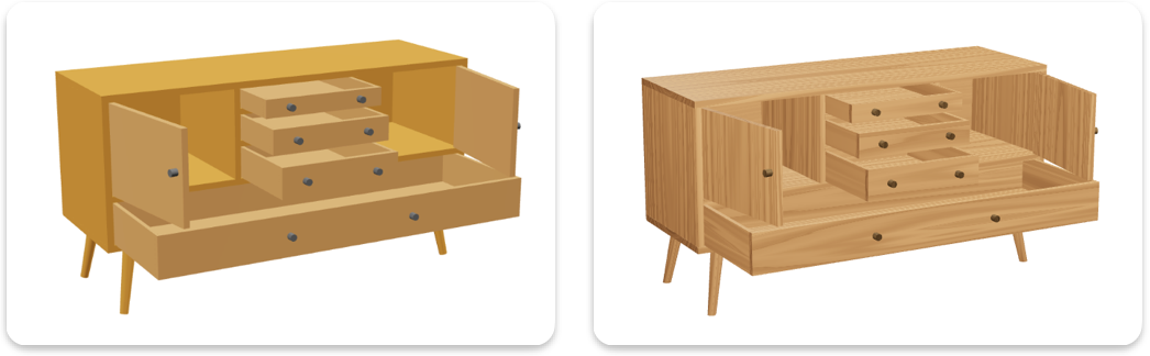
It was punchy, but maybe too punchy — somewhere between pine (which many dislike) and zebrawood (which almost nobody uses).
Into the woods
Well then, how do we make something look like… oak?
In 2026, the simplest answer is to just ask AI.
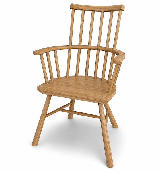
The results can be almost lifelike. Or not. It’s a bit hit and miss. It’s also (as of 2026) hard to control, slow, and sometimes sloppy with certain shapes or grain direction.
I think AI has the highest potential for realism, but we just don’t need that degree of realism. Besides, it’s very resource-intensive and thus quite wasteful when you are constantly changing your design.
A more traditional approach is to take a high-quality picture of oak wood and “glue” it on.
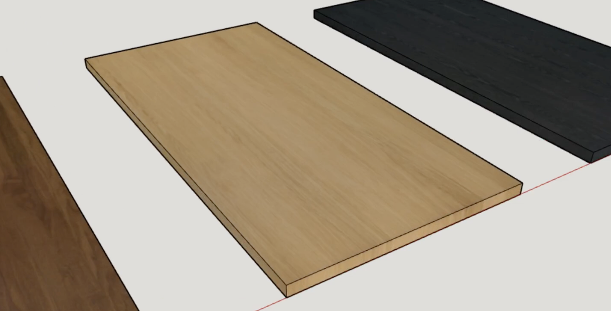
What’s not to like?
You need to find enough pictures (and good ones) to cover the whole model, or accept repetition. Good luck dealing with a 20-shelf cabinet! Also, it can be tricky to make the grain line up and look natural on the ends of boards. (Woodworkers will recognize the same challenges in veneering.)
☙
AI and texture images might very well be the two best-looking options. But there is something I value more than looks: user experience.
Pragmatically, the texture needs to auto-adapt to any piece of furniture you design in the app. It needs to render fast and have enough variation. And you shouldn’t need to waste time orienting it correctly. It should be effortless.
Is there another option?
A digital tree
The solution has a long history in video games. And it gets an A+ for sustainability: we need to simulate growing a tree.
First, take a board with a roughly wooden tone.
Next, add concentric growth rings.
The end of the board looks vaguely correct. And you can also see how the lines transfer to the board’s face… but they are too straight. Trees don’t grow in perfectly straight lines. So let’s make it randomly wavy.
Try playing with the dial above. When you cut through a wavy tree trunk, the fibers trace familiar cathedral patterns on the surface. We are getting somewhere!
Of course, in real life, rings are not perfectly circular or evenly spaced. Let’s adjust that too.
Isn’t it amusing how such a complex figure emerges from a few rather simple rules?
The final step is to carefully orient the grain on all furniture parts in the app: legs, panels, chair arms, and so on. But I’ve done that already.
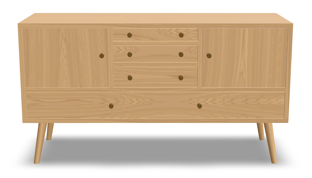
What do you think?
There are many things I ignored: knots, pores, rays, spalting, burls, chatoyancy. Yet the basic approach seems to generate pleasing textures. In theory, it’s also infinitely controllable, just like in the demonstrations above.
Is this helpful for designing furniture? I think so.
Would you like to adjust the wood tone or figure? Let me know via the feedback form. Or just go design something 🙂